Now we have the luxuries of mobile devices such as the iPad, iPhone and Galaxy Tab, it's hardly a surprise that many companies are having to tweak or redesign their websites to fit different screen sizes. It is not something we often think about when we pick up our iPhone and search a movie time at the local cinema and then head over to our computer to purchase the tickets.
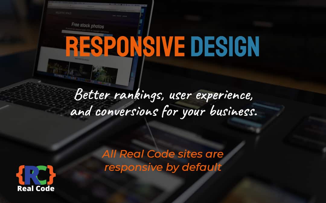
The website will still consist of the same link structure and content pages but the layout is dynamically changed to accommodate the width of your mobile screen which when demonstrated is simply amazing. For that to happen, the developers of a website often employ two different types of web design, either a simple mobile website or something a bit more sophisticated called responsive web design. Though both types seem to do the same thing, there are some very big differences between the two.A mobile website is generally much easier to build and requires a lot less work to build, which is why website developers are able to convert it for a mobile device within days of launching their full-sized website. Often times, a mobile website is much cheaper because of the amount of work it takes to build it. We have all experienced a mobile website in one way or another and sometimes it isn’t the most organised page to work with.
This is because of how mobile websites have one set design and they don’t fit different screen sizes. An example of this is if you loaded a page on your iPhone and then looked at your iPad, you might notice that the page is still fitted for the screen of the iPhone. There is no real graphics experience necessary to build a mobile website so it is done pretty quickly and cheaply.Responsive web design is very different from a mobile website and is usually much more expensive because of the skill and effort that it requires to get it set up. A website with responsive web design is when the graphics and text on a device adjust perfectly to the device you are using. It is not a simple coding process that you can add to a mobile website. Instead, responsive web design requires you to build from the ground up and include all of the graphics from the full sized website. Responsive web design allows you to choose the locations of certain buttons and lets the developer determine how they would like their website to adjust to different devices.Responsive web design is much more fluid and more advanced when compared to a simple mobile website. It is safe to say that responsive web design is generally where the internet is heading, with more and more sites choosing to upgrade instead of sticking to the general mobile website. The reason this is happening is because of the amount of control the developers have over the conversion to mobile. Though it is more of a process, the website comes out looking much better and more interactive. Ultimately, the benefits outweigh the costs if a business wants to engage customers in any way possible, namely with a user intuitive site that delivers the same experience across devices.
It is safe to say that responsive web design is generally where the internet is heading, with more and more sites choosing to upgrade instead of sticking to the general mobile website. The reason this is happening is because of the amount of control the developers have over the conversion to mobile. Though it is more of a process, the website comes out looking much better and more interactive. Ultimately, the benefits outweigh the costs if a business wants to engage customers in any way possible, namely with a user intuitive site that delivers the same experience across devices.
Contact Us
We partner with many UK businesses helping them get more leads and sales from the internet, be our latest client.