In today's competitive world, it is always important for businesses to be up-to-date with the innovation in technology. After the mobile revolution and social media explosion, the present trend is about optimising your marketing campaigns across multiple platforms and channels. Responsive web design is become popular for this reason, in recent times.
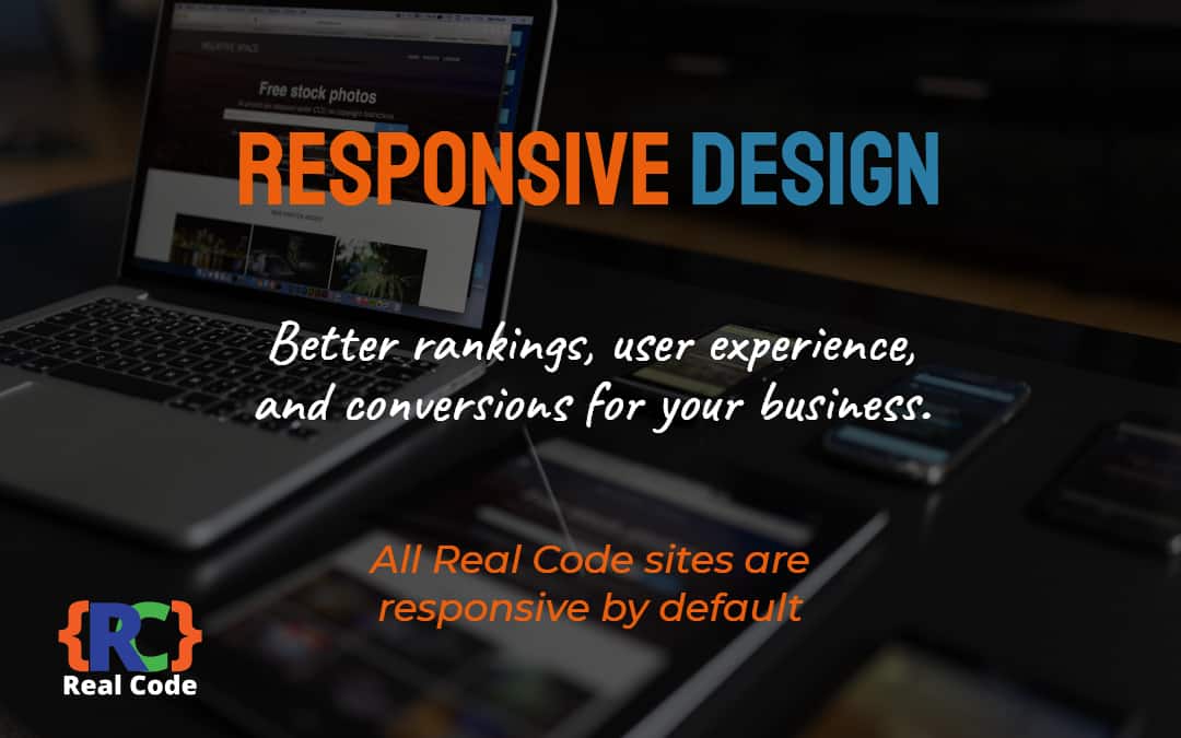
An overview of responsive design
A responsive design is about creating a website in such a way that text, images and layout is displayed in a similar way on every device. Normally, websites are designed for a desktop view. When a user accesses the website from a mobile, the layout shrinks to fit the size of the mobile screen. As the site is not optimised for a mobile device, the user experiences difficulty in viewing the content or navigating through various pages. On the other hand, responsive websites adjust the layout to the corresponding device to provide a rich user experience.
How small businesses can take advantage of it?
For a small business, the budget is the key. A responsive design eliminates the need to create multiple versions of the site for multiple devices. You can create a single website and still optimise it for various devices. While you spend money on the design, it provides more returns in the long run. Secondly, it allows you to target a wider range of audience. The majority of US adults own a mobile phone and most of them use it to access the Internet. When you provide good user experience, conversion rates would surely increase. Moreover, you can retain customers to make recurring sales.
Responsive websites reduce complexity in the site navigation as well. When you have a desktop and mobile versions on your site, managing them becomes tougher. On the other hand, having a single URL is always beneficial. While users can easily navigate the site, the possibility of desktop users viewing a mobile site is eliminated. Another benefit is that you can use a single URL in your ad campaigns. There are several instances when a mobile website was shared on Facebook and a desktop viewer has viewed that page. With responsive designs, you share a single URL and every device gets the same layout.
Another important aspect to consider is the social media. Today, it is not easy for businesses to ignore social networking sites like Facebook and Twitter. Every business needs to create a fan page on Facebook to stay in the competition. Today, social media is more on mobile. A large group of Facebook users access the site using their mobiles. In fact, half of Facebook users would access the site at least once from their mobile. When your website is not optimised for a mobile, there is no point in putting it on Facebook. A responsive design comes to your rescue in this regard. It doesn't matter if the user accesses social media sites using a desktop or a mobile, your content and layout remain the same.
Contact Us
We partner with many UK businesses helping them get more leads and sales from the internet, be our latest client.